SoFruiti
Art toy vendor concept built around visual design and collecting culture.


What is "Sofubi"?
The term sofubi is a combination of the Japanese words for “soft” and ”vinyl,” referring to traditional toy figures made of PVC. Collector communities became popular amongst vendors who distributed internationally and locally manufactured toys to their respective regions.
The Challenge
Despite sofubi's rapid evolution as a cultural icon, shop websites often featured outdated UI/UX. Building a collection is very unique to each hobbyist, the process of acquiring their collection should reflect this. The goal of Sofruiti was to envision a vendor website that embodied the colorful nature of sofubi, art toys, and collecting culture in general to merge online communities with a modern digital experience
Timeline
May - July 2023
Role
UX Designer/Prototyper, CAD Designer
Tools
Figma, Illustrator, Blender


User Flows
Two user flows were created representing the demographic goals: purchasing a new toy and displaying it after acquisition.
Due to the diversity of art toy genres, filtering the search and display processes became the starting point for ideation.


Ideation
Toys are meant to be fun and exciting, so why should buying them be any different?
As I sketched, my goal was to envision solutions that would lead to a playful interface. Attention was paid to navigation modules, methods of indication, as well as scale and composition


Lofi Wireframing
During conceptualization my goal was for users to feel no stress when it came to finding the toy they've been looking for. A shopping experience that puts no burden on the buyer to make an obligatory purchase, but also one where they might venture off and discover new fascinations.

Branding
Playful, whimsical, maybe a little spooky too
After playing with a variety of color palettes, I chose the primary and secondary colors of a vibrant orange and cooling purple. The strong contrast between the two creates playful connotations and a fun, spooky vibe.


Navigation
The scalable overhead tab system tracks the user as they move between the four major task flows: shopping, artists, community, and account information.
Located to the left and right of the overhead tabs respectively are a search bar and cart widget, both equipped with visual cues to signify changes and actions.


The secondary tab frame appears in the shopping portion of the site and is used to consolidate the many categories of the store's products into one streamlined interface.
The most popular item categories are visible by default and the tabs can be shifted to reveal the secondary subset.


Product Cards
Placing the outline of the product in front of a cropped background gave the toy a more vibrant allure. The surrounding components were guided by color signification and given ample breathing room to achieve a balanced look.


Artists and Brands
The SoFruiti Artists page gives familiar buyers and newcomers an interactive way to search for artists new and old – empowered by sticky search, sort, and filter widgets that are clear and accessible. A landing page for each artist and brand tells the user a bit about their story along with a curated collection of their products.


Connecting with the community
A red sea opportunity I saw to generate traffic and drive brand loyalty was the installation of a community section.
My vision was that buyers and hobbyists could show off their treasures, get a glimpse of other collectors' hauls, and buy and sell items in the same platform.


Checking out in style
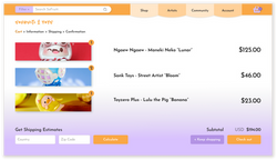
The checkout process was designed with the brand's colors and design language in mind to establish familiarity without any frustrating add-ons. Emphasis on active selected elements tells the user exactly where they are, how much the total is, and how the price is calculated.
 |  |  |  |
|---|
Account
The My Account tab is where the user can find all of their purchase, payment, and rewards information, as well as a personalized digital showroom of items purchased through the site.
 |  |  |  |
|---|---|---|---|
 |
Collectors can customize their digital showroom and publish it to become viewable by the SoFruiti community. I envisioned this could be a platform for users to connect with others by discussing, trading, and selling.
Takeaways
Cluttered toys can still be clean and organized
My primary goal when beginning the SoFruiti project was to solidify my skill in spacing, proportions, and proper frame construction. I focused on optimizing elements that were familiar and well-used by online shoppers and simplified overloaded content that detracted from the carefree experience of toy collecting.
I strove to design a system that emphasized clean, interesting visual elements while ensuring that practical implications such as scalability and contrast still spearheaded the design. While still remaining neatly constrained within the context of a vendor's operational limitations, I was able to cement an optimal user experience for the primary demographic.

Interested in checking out more?
You might also like..


